Travel website usability by a travel writer

I’ve written before about how much airline websites annoy me for their lack of usability, but it turns out I’m not the only one: Check out this article by The Age travel writer Clive Dorman. He might not be talking about things in the same way as I have, but he is far more eloquent:

…[I ] had a dream about a super-fast airline website that performed each action so fast and seamlessly it was truly joyous (OK, so I’m part-nerd). I was truly disappointed this morning when I realised it was still a mental pie in the sky. (Read more)

Clearly Clive has experienced the same problems I and no doubt countless others have, and he is giving them voice in a large platform. The airlines need to listen to this kind of feedback; the first airline to get their website right is likely to gain some business even if they are a little more expensive than the alternatives.

Consumer trends in business applications?

ERP software analyst Stephen Jannise from SoftwareAdvice.com ecently emailed me with a link to an interesting post about social and e-commerce software trends that could be implemented in business-based software.  Trends he highlights include Twitter-like feeds, the ‘like’ button on facebook, and Google’s search autocomplete.

I don’t necessarily agree with Stephen’s perspective on each of the features he covers, but I don’t want to post about why now, because he’s running a poll and I don’t want to screw up the results for him by introducing bias. Having said that, his post raises some really interesting ideas, so get over to his palce and read the post and vote in his poll–once he posts the results (which he is going to make public), I’ll comment on the features myself.

iPad: Sit and listen, don’t speak

I recently had the opportunity to use an iPad for a while at work (I know, I’m already well behind the cool kids).  I found the device not wildly exciting, for two main reasons.

The first reason is that it is a single-user device, so in a situation where one has been bought for everyone to have a play with and try, the device is very nearly hamstrung. Admittedly with a little more effort I probably could have convinced the thing to talk to my itunes account and downloaded some free apps and cool stuff, but the fact that this was not obvious means this is not a device to be shared between people who don’t share passwords and credit card details.

The second thing that was more immediately obvious, and more confounding was that within even a few moments of interaction it was clear the iPad is very much a device for consumption, and not for production. Although the touch screen would make the ipad an obvious choice for some kind of gestural or pen-based input, this isn’t available (perhaps Apple are still smarting from the spectacular failure of the Newton?), and the native “keyboard” is noticeably clunky to use. This means that for all production purposes–even those which involve consuming media (such as annotating books or pictures, gestural photo or video editing)–that would seem ideally suited to a touch-based interface, the iPad in it’s native state is essentially useless. Even doing a Google search on this thing is hard. And while there are pens you can buy, and keyboards, and apps and all kinds of workarounds, it doesn’t change the fact that all of these things are not what this large and expensive piece of equipment was designed for.

I’m not alone in my assessment of these limitations of course. Larry Marcus says that the iPad is no replacement for a laptop unless you are primarily a consumer. Nathan Jurgenson at Sociology Lens reinfirces that prosumption is not where it’s at for the iPad. Jeff Jarvis, in his must-read review calls the iPad vapid and shallow, and points out how it is a move backwards from the open content the web made possible. Cory Doctorow takes it one step further and points out the iPad itself is a closed device. Jonathan Zittrain points out that even Apps don’t make the iPad open because they are vetted (and makes some very interesting points about a large antitrust suit against another technology company).

None of this is to say that the iPad doesn’t have a market; Jake Simms thinks “grown ups” will like it, Steve Myers reports on a panel at SXSW that suggested the iPad is designed for “laid back” computing, and Kathy E. Gill says we will have to wait and see how people use it in their consumption activities.

Personally, I won’t be getting an iPad; I have a netbook that does all the consumption things an iPad does except nice ebook reading, and there are cheaper ebook readers (if and when I decide to get one) and plenty of prduction things besides. While iPads are very du jour, I think they have missed a number of interesting interaction possibilities afforded by a touch screen, and I will be interested to see where they go from here.  Any iPad users care to comment on their use?

What’s not being considered in the MEL train debate: User experience

As a frequent traveller, I’ve noticed the long drawn out debate about whether Melbourne ought to have a train to the airport has heated up again this year, possibly as a result of Victoria’s transport minister Martin Pakula saying it isn’t a priority. I have to be honest, I have a vested interest in the outcome of all this. As an expat Kiwi living in Melbourne who travels home regularly and has experienced the best and the worst travelling to the airport has to offer, I’m firmly in the pro-train camp–but the reasons for this are more than just my personal best interest, as we shal explore below.

Those arguing for rail point out that it could bring signficant money to Melbourne, that Melbourne is growing (as is the congestion on the Tullamarine freeway), and that it is a necessary competition to the exhorbitant parking fees paid by those who drive to the airport (this last from the Australian Competition and Consumer Commission). Those arguing against a train claim it is not needed and likely to be uneconomic, based on experiences in Sydney and Brisbane, and that a travel time of 40 minutes each way to the airport during peak time is acceptable.

At present there are three main options for getting to and from the Melbourne Airport:

All of the currently available options have significant negatives for all users: those in Melbourne on business can expect to lose nearly two hours of their day travelling between the CBD and the airport; disabled travellers may have trouble getting to and from the airport at all; the first and last thing tourists see of Melbourne is either the SkyBus or a taxi, both of whch travel on the congested Tullamarine Freeway; and regular travellers face the choice between the possibility of a long wait at the airport if they allow sufficient time for traffic or (and I speak from experience here) cutting it hair-raisingly close to missing an international flight. Things are sufficiently bad that it makes sense to have a rail link simply on the basis of the improved experience of those who need to get to and from the airport–and if the planners that be get it right, the improved user experience will also make a train make economic sense.

Captcha and accessibility

I’ve written before about the problems with anti-spam devices, but today I read some wonderful blog posts on this, and since I’m neither a user with a dsiability that prevents me from using CAPTCHA, nor an expert on accessibility for users with visual impairments, I will let the posts speak for themselves:

  • One user’s experience trying to sign up for a Gmail account, which failed because CAPTCHA has accessibility problems.
  • A study, showing that this is the majority experience of CAPTCHA (73% of users were unsuccessful using the ‘accessible’ version of CAPTCHA)
  • A discussion of the issue at Feminists With Disabilities, noting that to provide Google with feedback, you have to get through Captcha first, and how this further disavantages an already disadvantaged user population.
  • A link to the Google accessibility reporting function–please use this liberally if you notice any other problems with Google’s interfaces (and you have been able to sign up for an account).

As this article on anti-spam devices points out, it’s not just users with visual impairments that suffer when presented with CAPTCHA, it’s also users with reading difficulties, and even users without disabilities suffer some inconvenience.

It is telling that  one of the best cited posts on Captcha effectiveness (which finds CAPTCHA to be very effective) refers only to the ability of CAPTCHA to prevent spam. The “false positives”, where CAPTCHA fails to allow a human being to access a website, are dismissed with a single line “these are eminently human-solvable, in my opinion”, while pointing out that CAPTCHA is used on most interactive internet sites.

Spam is a usability and accessibility problem, but the way to solve it should not prevent users with disabilities accessing internet content. Not only is CAPTCHA as an approach inaccessible and unusable, but it’s widepsread implementation could end up costing sites which use it a lot of money.

Search isn’t king anymore: Google recognises browsing

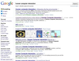
Earlier this week, I was doing some Googling and I noticed something weird: Google now has facets that are visible all the time:

Google search results showing a range of left-hand facets and an updated interface, for example a new button shape.

Google with facets

You might also notice that the interface appears more modern–the shape and appearance of the button has changed, for example.  You can read more about that at the Google blog, but it’s notable that a lot of what they have done is good for users; the new logo is more readable and will likely be faster to download for example.

The thing that really excites me is that Google has recognised that search is no longer king: by including always-visible facets on the Google results page, they have recognised that browsing, refining, and manipulating results sets are part of the natural human information seeking process.

Larry Page (one of Google’s founders) once said that “the ultimate search engine would…always give you the right thing. And we’re a long….way from that”. I don’t think he’s right, and the reason why I don’t think he’s right is that it is not always readily apparent, even to the information seeker themselves, what they want. Sometimes, it’s easy to figure out what information will answer our questions; when we want to know what the formula is to convert degrees fahrenheit to degrees celsius, for example, information seeking in the information age is straightforward and requires only a simple search ( ‘how to convert from deg c to deg f‘will get a perfectly serviceable answer, and in fact if all you want to do is convert a temperature you can use Google’s ‘in’ operator by typing ‘16 C in F‘, for example).  Sometimes, though, you don’t know exactly what you want; “a good present for my brother” or “a good book” or “how users search the library shelves” are information needs that can’t be met by typing a simple phrase into Google; they require a process that includes searching, browsing, and refining.  Take the “good book” example from above; you might feel like a mystery or modern literature, and once you;ve decided on that you might like a certain author or subgenre, but who or what that might be might also require some digging around to discover, and once youv’e decided what you want to read you have to figure out how to get it–as an ebook? from a library? from a bookstore, either online or physical? This example shows how we search out there in the real world when there isn’t a straight answer (and sometimes not even a straigth question), and how important it is to have the option to browse; again taking the book example, browsing might also show you other books that seem like you might enjoy them.

This isn’t the first time I’ve talked about Google and browsing–I’ve discussed before what a great thing it is that Google is incorporating browsing (and you can read more about how important browsing is in that post), and how their choice of facet location has influenced where we put the facets in our library search (and I’m really glad we went with Google on this one now). This is the most exciting time I’ve talked about it, though; Google’s results pages now reflect a truly natural information seeking process (without destroying the interface for “quick searches”), and thus represent a much better user experience than they have in the past.  Not only that, but this development will have a feedback effect: because Google has them, facets are more likely to be used in other information seeking interfaces (because users are used to them), and thus the experience of many of these interfaces will be improved as well.

Women in tech, inclusive design, and the lesson Apple learned today

Women are clearly a minority in tech fields, both in education and in the workforce.  There are a number of reasons why this might be the case, including cultural attitudes, lack of mentorship and outright hostility to women in tech. This post isn’t about the cause of having so few women in tech, though–it’s about the results. People tend to design for themselves, particularly in tech–and this is perfectly expected, but it does mean that with the paucity of women in tech fields, the design work in tech is not often done with women in mind. Testing on people not-like-designers who use or might use the thing you design is pretty much the core of usability.  Given that women do purchase and use technology, if possible it’s worth including some of us in any design team and it’s always worth including them in the testing phase of any product they might use, because they might just see it differently (this principle also applies to products that might be used by children or the elderly or anyone who is a target market for any product, particularly where they are not represented on the design team).  Back to women, though: today Apple has learned about including woment he hard way.

Today Apple announced their much awaited new toy.  As many people predicted, it is a tablet, and they have called it the iPad.  The name has problems, including the phonemic similarity to iPod which one of my workmates pointed out, but more embarrassingly for Apple the connotations that immediately led to not Apple, nor iPad, but iTampon being a trending topic on Twitter and some pretty vicious skwereing on sites like adfreak

Apple's iPad spoof advertisement showing feminine hygiene product

This isn’t the first time Apple has forgotten women in it’s design process, I’ve already blogged about the direction of the clip on the iPod shuffle. Despite the free publicity, though, this is the one they might learn from–being ridiculed all over the internet probably wasn’t what they hoped for with this announcement. Apple may well have had women in their design process (there is a strange kind of groupthink that goes on on team-based design where people miss things that would bee seen by anyone outside the team), but they clearly didn’t test on a diversity of women.

The name of this product shows it wasn’t designed with me in mind, and makes me a little less likely to buy it as a result–this design, like the clip on the shuffle isn’t inclusive.  Obviously not enough people complained about the shuffle, and Apple didn’t understand the need to include women in design and testing.  I bet they will next time, though, and I hope other companies have seen Apple’s mistake and learned something too.

Kartoo was clearly not for many users at all

Phil Bradley posted on Saturday that Kartoo, the visual search engine I blogged about as part of the 23 Things programme, is gone.

Back when I posted about Kartoo the first time, I mentioned a number of reasons why it might actively alienate some users, including its treatment of culture and gender–this isn’t a good start for a search service trying to break into a market that already has such clear dominance (Google accounted for about 70% of all searches in December, and is working to expand its range of services and thus its market share).  Had Kartoo really offered something interesting, then it could have attracted continuing use from those it didn’t offend at first sight, but like I and many of my fellow travellers on the 23 things program discovered back in 2008, Kartoo also didn’t offer anything interesting or useful in its interface or its results (and in fact it was downright hard to use).  Given how much you have to offer to break habits that work for users, Kartoo fell far short of the mark, and while I’m not so convinced that it had nothing to offer that I’m glad its gone, I’m not surprised either.

Password masking, and the difference between usability and user experience

Recently Jakob Nielsen recommended removing the little black dots that come up when you type in a password, and having your password come up in clear text instead.  He had some pretty good reasons for recommending this including:

  • Increased password security
  • Mobile usability
  • Error prevention

However, Nielsen also recognises that there are some situations and some passwords (for example banking passwords) where the security outweighs usability. You can read more in his article about the matter here.

Responses to his idea ran the gamut from wholehearted agreement (by a security expert no less)  through tentative disagreement to pretty strong disagreement.

There has been some comment on the sociotechnical aspects of password masking, including using masking as a reminder to users that they ought to keep their passwords secure, and a discussion about the reasons why many people are uncomfortable with masking.

Other responses suggested solutions to the problem, including displaying only the most recently typed character (like on the iPhone), and giving the user the option to unmask (rather than mask) a password.

I completely understand the usability reasons for unmasking passwords, and I agree with what Jakob Nielsen is saying, up to a point.  My preferred option, out of all the ones suggested though, is the last option, where a user can choose to unmask a password, and my reasons for this are a common context of password use, which I will illustrate with an example:

I’ve just finished a large group project to launch a new library catalogue; we did a lot of collaborative work, and spent a lot of time using computers that projected onto a large screen.  We frequently read email to remember discussions we’d had about the system, manage links, manage to-do lists and generally remind us what was going on (this is a really common way–PDF of storing “stuff” in one’s headspace), and the system had components we had to log into.  We were logging into and out of systems left and right, and always on a big screen. I work at an institution with a single sign-on–this means your password for the HR system where you manage your payroll and salary, your library password, your email password–they’re all the same thing (bear in mind, single sign-on is good for security, users are less likely to use bad passwords if they only have to remember a few of them). Even more frequently than we had these meetings, two or more of us would be clustered around a desk testing some aspect of the new library system that required a log in or out.

I can’t imagne that either of these scenarios is uncommon in the workplace, meaning that in Nielsen’s world users would all share their passwords.  Similarly, I imgaine it is fairly common in social contexts, particularly with shared hosues and computers. Sharing passwords is undesirable at best, and I don’t need to describe how much damage one bad apple in a workplace could do under such circumstances–and it would be extremely difficult to track down who that person was, and what they had done when a large group of individuals all knew each others’ passwords.  Not only that, with single sign on passwords provide access to confeidential and sensitive information, including (at my institition) email, leave details, salary details and library details.

Just like with Nielsen’s solution, having characters disappear one character at a time essentially clear-texts your password to anyone who happens to be present, leaving the only options to balance security and usability as the check-box options.  Nielsen suggests that the checkbox be “hide”, but I disagree.  The social implications of a “hide” box are that you have to make the decision to hide your password from your colleagues or loved ones or friends in front of them, which sets up the potential for interesting dynamics around trust in professional and personal social interactions.  My preference would be an “unhide” box that implies it is simply natural to keep one’s password hidden–thereby avoiding any issues of trust in situations where otherwhise passwords might be shared.

The problem with Nielsen’s approach is that it is a purist usability approach.  If all we cared about was making systems more usable, absolutely it would be right to expose everyone’s pasword, and have the option to hide it occassionally as necessary.  This could lead to extremely uncomfortable social situations in both the work and personal spheres, though and as such is poor design of user experience, which takes the context of use into account–and I can’t recommend something that would so frequently lead to bad user experience.

So, what do you think?  Should we all show each other our passwords?
Help text: What it isn’t for

My life has been interesting lately: We’re implementing a new library catalogue which also means re-implementing most of the library web-site.  This has meant the need, in some cases, for new help text, and while I am not a technical writer, I have done some technical writing in the past, so I got the job (that, and I put my hand up for it since everyone is busy).

In preparation for writing the help text I needed to write, I reviewed a lot of other help text, and I found a pretty common mistake: Using help text to fix up  problems with an interface.

One of the help texts I reviewed was for the search history component of a search service.  This service automatically kept all the recent searches, and allowed users to save searches more permanently, and file these saved searches away in different folders for later recall.

The help text for this service explained to users what ‘this session’s queries’ and ‘saved queries’ were, and identified the non-standard icons used for moving searches between folders. Help text in this case is a band-aid for the mistakes made in system design: the word ‘searches’ should have been used in place of the word queries, and if the folder system could not be made drag-and-drop, the icons should probably have been replaced by words (or at least standard icons).  This would have dramatically cut down the need for help text, and more importantly (given that only a tiny minority of users read help text), improve the general usability of this feature.

Whiel the feature described above was a pretty clear example of using help text the wrong way, it was far from the only example I could draw on, and this is fairly disappointing. Help text is for systems that are genuinely complex, not for putting a band-aid over poor user interface design.  When was the last time you had to read the manual to do something simple?


Subscribe

License

by-nc-sa.png
Some rights reserved.

Comment moderation

If it is your first time posting, your comment will automatically be held for my moderation -- I try get to these as soon as possible. After that, your comments will appear automatically. If your comment is on-topic and isn't abusing me or anyone else who comments, chances are I'll leave it alone. That said, I reserve the right to delete (or infinitely moderate) any comments that are abusive, spammy or otherwise irelevant.